


LIFE IN REVIEW is a book I designed and wrote. It's about shifting perspectives -- mostly around faith and belief systems. It is interactive in that it calls for the reader to mark it up, reflect on life, consider questions, observe art, and engage in the practices.
If you are interested in more info: alwaysdeconstructing.com
or grab the book at: amazon.com
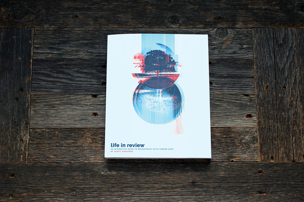
FOR THE COVER
I used an art piece that I had previously created. However, with this round I chose to strip down the piece to only a few elements then use some "glitché" effect to finalize the style. I wanted the title, subtitle, and author lines to be subtle - in order to provide the most space for the artwork.
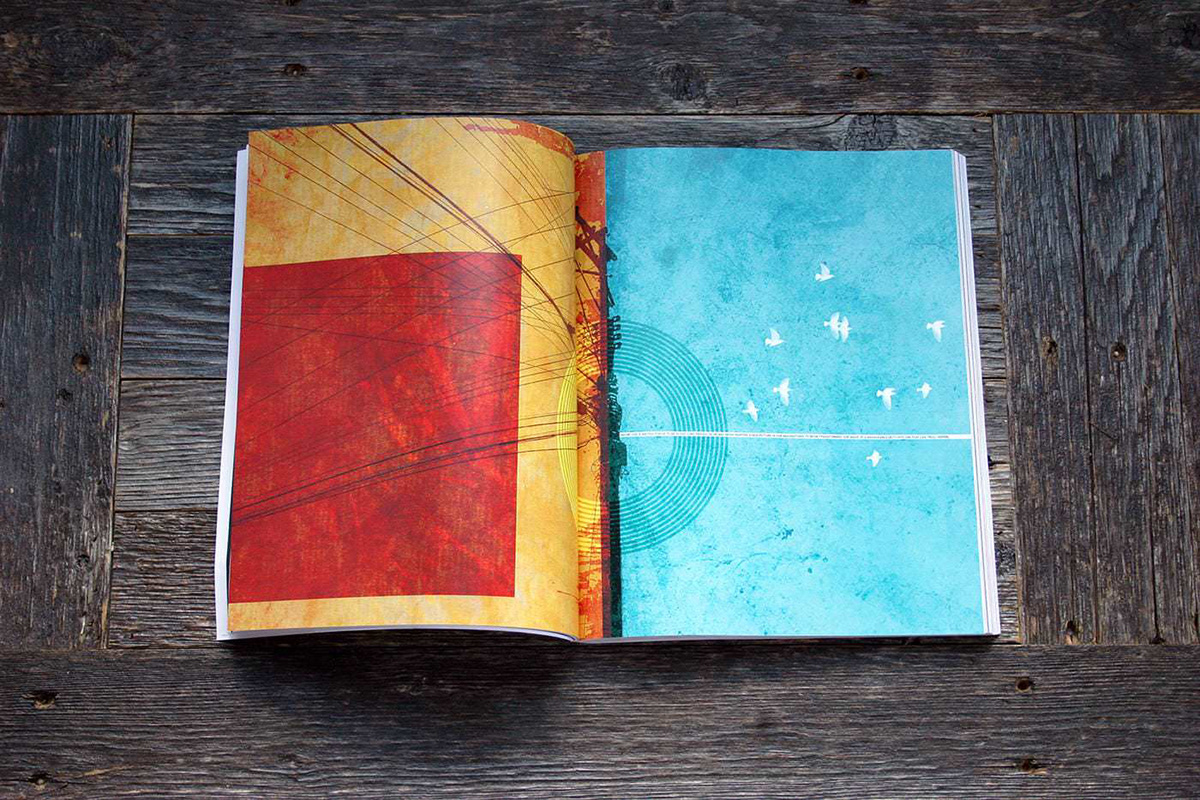
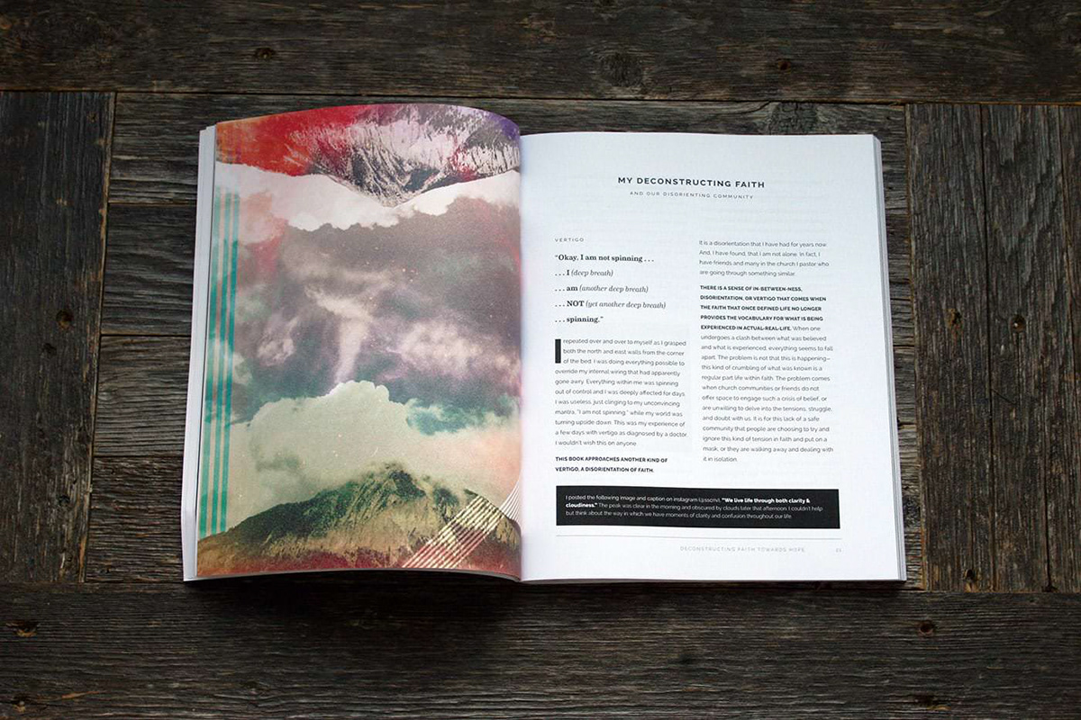
THE USE OF ARTWORK
The book was always meant to be a full visual experience. While I wrote with the intention to make a connection with the reader, I wanted to maximize that connection through the use of visual art, poetry, song lyrics, and a varied type family and style. I reached out to several artist that work had been personally meaningful. Overwhelmingly, I heard affirmation for usage of their work. I am still quite humbled that they agreed. I think the final count was five artists works are included. Check my site alwaysdeconstructing.com for links to additional work of each artist.
THE USE OF TYPE
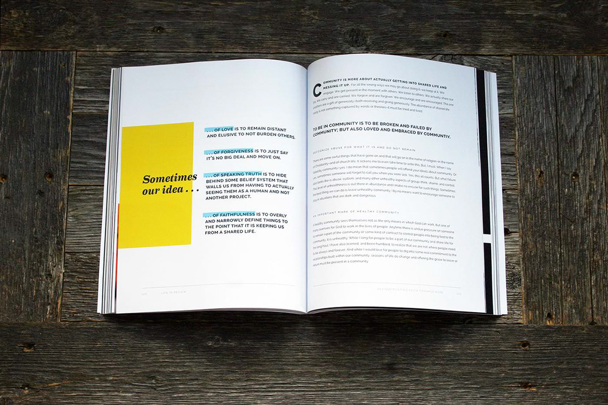
I wanted to keep the type styling as consistent as possible, but varying it at times to bring in emphasis. I used Raleway as the sans serif for body copy and headlines. I used Eames Century as the serif for quotes and call outs. Thoughout the book, I did take a few liberties with the type–where I thought I could break my own "rules" for effect.

PHOTOGRAPHY
I was thrilled to get to use some of the photography of my son and daughter. They both have a really great eye with the camera. I selected a few from each of their portfolios to add to the book. The other photography I used was from unsplash.com – which is always a great curated source.

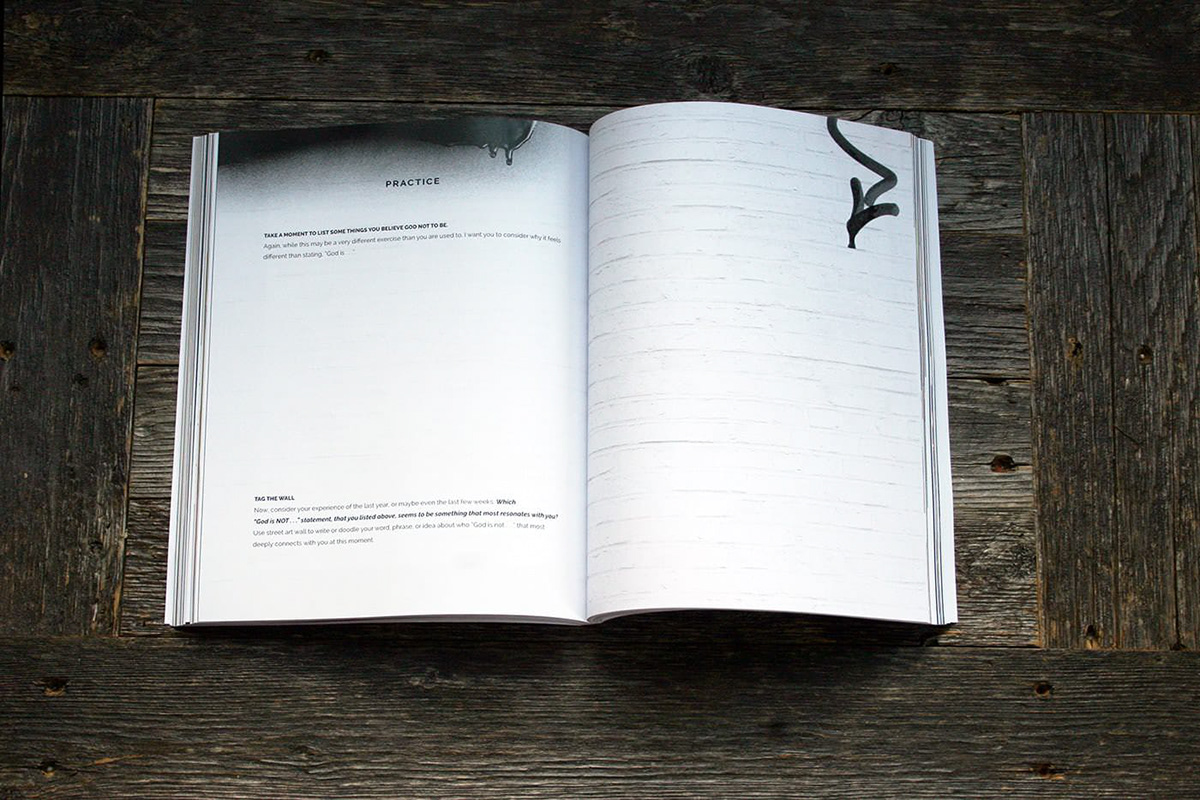
INTERACTIVE
The real key to the book was inviting the reader to explore their own story. I was telling mine, and the story of a group of people, but it was all in an effort to help draw out the story of the reader. Therefore, I was going to have to create some whitespace in the layout. One, I wanted the whitespace to help the content feel aired out and light, even though the subject matter isn't light. Two, I wanted to make plenty of room to write, draw, doodle, and process for the reader. Each chapter offers some different interactions. The one above invites you to be a street artist–using your best graffiti to consider your story.


